Responsive Web Design
Responsive web design is a term being used and heard more often in the web design world. It’s true that responsive web design has taken on the Internet design world by storm.
When you look around at the incredible plethora of devices on the market these days it’s not surprising that current market research shows mobile internet usage is set to grow massively. Undoubtedly this change in the way people are consuming online information and viewing websites means we need to be considering how we engage with them to offer the best online experience for our brands and services.
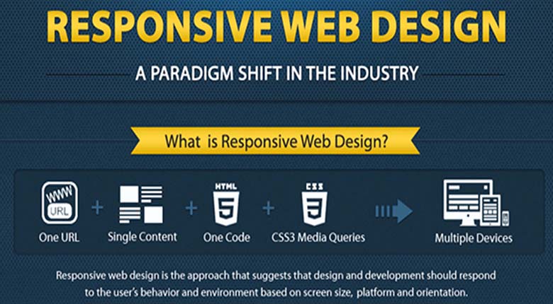
Responsive Web Design is a collection of techniques that allow a website to flex and adapt to the size of screen it’s being viewed on. Someone opening your site on a small smartphone will be shown the same site as the person opening it on their laptop but the site will have noticed the constraints and automatically reformatted to give the user an experience better suited to their device. No more loading a huge website and having to zoom in and out to find the content you’re looking for. Responsive web design takes into account interaction too and makes your site easier to use by acknowledging and integrating things like touch screens to aid navigation.
Benefits
So now (hopefully) you understand what responsive web design is, perhaps we should have a run down of the benefits.
- Future proofing. Responsive sites work well across the multitude of existing devices on the market. It’s a safe bet it will for considerable time to come.
- Better, faster, smarter user experience. Optimizing your site no matter what the user chooses to view it on makes their life easier. Happier customers mean a happier business.
- Cost Effective. Responsive sites take a little longer to put together, but they survive longer and the unified approach means management, support and upgrades only need be applied to one place. That saves time and money.
- SEO optimized. Managing SEO for separate mobile and desktop sites is hard and doesn’t produce great results. Google actually recommends a responsive approach to combat these problems and a consolidated view of your results means more focus.
- Improve conversion rates. An optimized and consistent site, no matter what platform it’s viewed on, provides a better experience for the user which is more likely to lead to them engaging with you than going elsewhere.
Eduhive Creative Studio enhances your website and makes it responsive, so that all visitors can easily navigate and search your website no matter what device they’re using. If you’re seeking a website redesign, and one that is responsive, Let’s talk to get started!