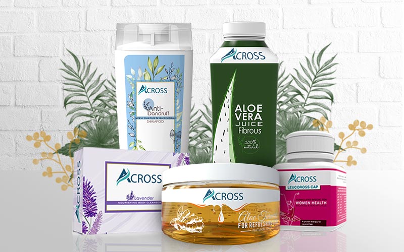
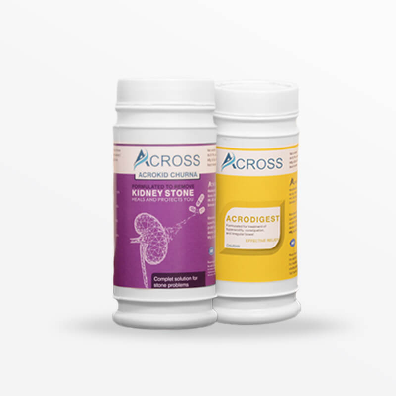
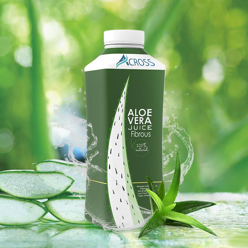
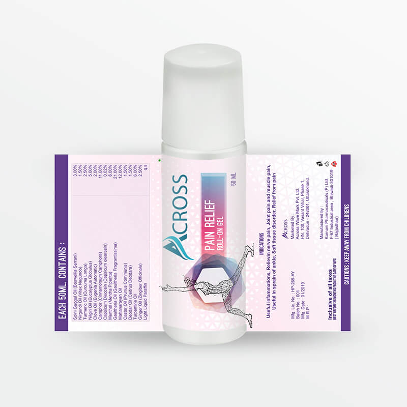
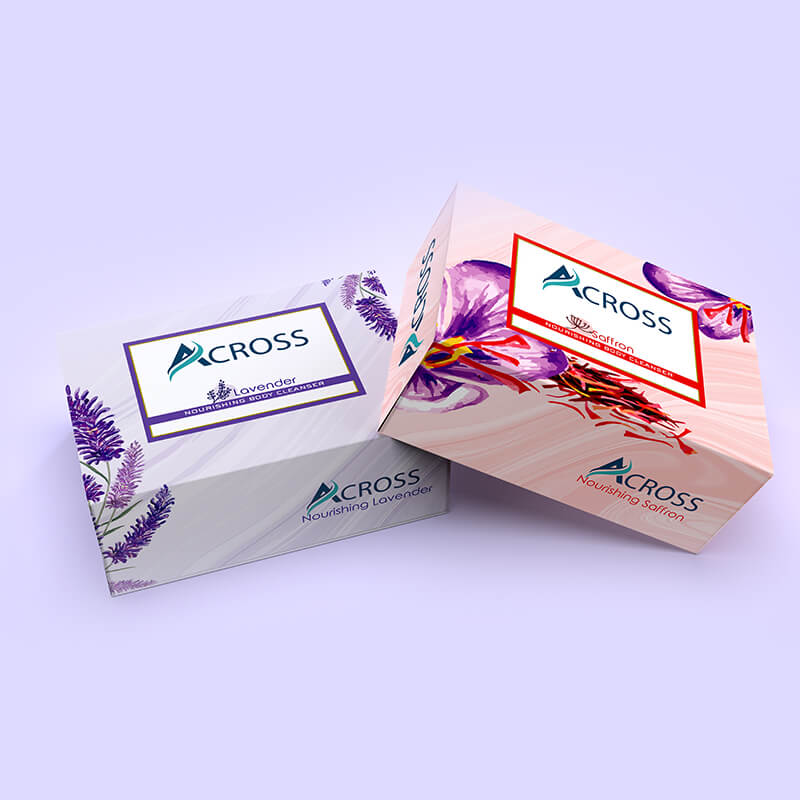
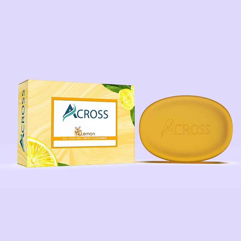
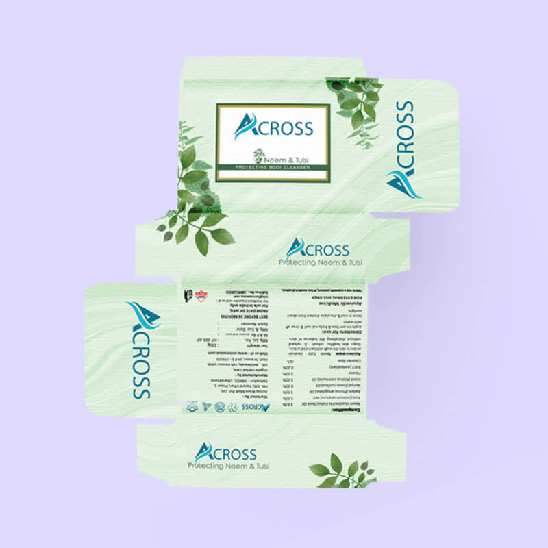
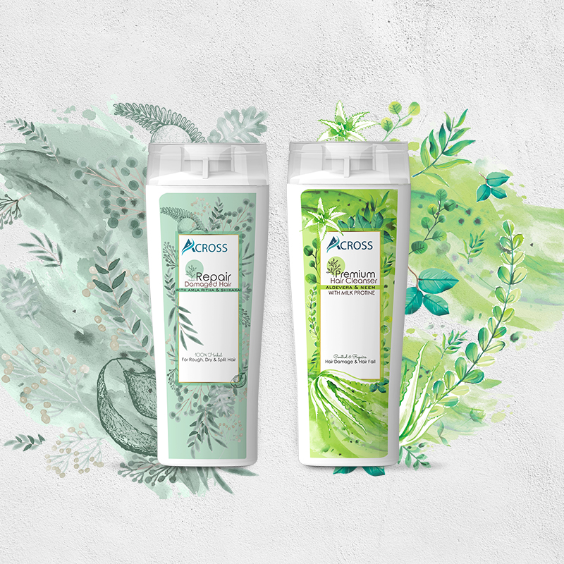
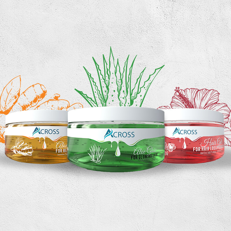
A startup trusted on our brand design services to go forward with brand development for sale of herbal wellness products pan India. Through our research we figured out that segment was highly competitive with age old big brand that had networking channels build over decade. To stand out in this clutter, the product required two distinct features – a simple yet attractive name to capture the essence of wellness and a packaging to make the product stand out, while maintaining the brand’s Indian-ness (to leverage the local connect). We aimed to create distinct imaginary and packaging quality for products rooted in with nature call that makes it appealing to new age food lovers. Developed a packaging design strategy that encoded greater value and a natural experience in a bottle. The client expected from us to create packaging that had to be visually appealing and reflect the vision of across wave along with the communication that these products were herbal and made for general wellness purpose. The biggest design challenge was to create not the identity so much as a visual language, as an ambitious new brand, across wave needed a professional, trustworthy image of an experienced company. Our goal was to make a coherent design across different mediums that would allow specific product lines to shine at the same time. We knew that acosswave visual language had to be extremely bold to stand out from the crowd and be remembered by demanding clients who see dozens of different cosmetics and supplement packagings on a daily basis. Health Personal Care Website is a vehicle for the brand’s presence. We created user interface copy that fits product descriptions and underlines across wave core values. All texts have a direct, personal tone. It was important to us to make customers feel like they’re talking to the brand’s creators who perfectly understand their needs.Identity & packaging
THAT RESEMBLES
THE PRODUCT
BRAND DESIGN SERVICES
Deriving The Logo
PAVING THE ROAD AHEAD
User Interface Design
A Brand - First Online Store
