Brand identity system for start-ups
Branding a company takes time, money, and experience. Small wonder it’s not exactly high on the priority list for most early-stage startups. A brand is more than a color palette and a slogan. It’s the psychological force behind your business. If you’re building a new brand, I’m going to let you in on a little secret. Simply having a logo doesn’t guarantee your brand identity is going to work for you.
A great brand identity is a system of elements working together to provide unity, consistency, and flexibility. This system of elements can be broken down into three main pieces of your brand identity:
- A flexible logo
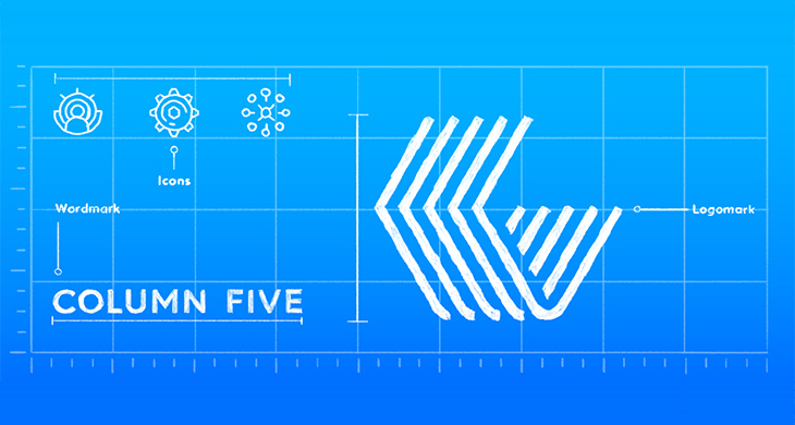
Your logo should be the core of your brand. It’s the combination of words, symbols, and design elements that helps identify your product or service. You logo need not literally show your audience what you do, but rather become a symbol for your unique offerings.
You should be able to use your logo consistently. It should work well large (like a sign or billboard), small (think social avatars and favicons), in color, black and white, in print, and on screen. And in almost every instance, the more simplified your logo, the better.
- Mark
To add even more flexibility to your brand, consider utilizing a mark.
Your alternate mark could be as simple as removing the words from your logo. This is basically a symbol which can show the essence of your business and remind your customers about you. This doesn’t have to be a completely different design from your main logo. This can also be the symbol that you are using in your logo.

- Color palette
One of the fastest ways to create a recognizable brand identity system is to own a color.
Most brands utilize anywhere from one to three main colors. As such, if you’re limited to just one color for a marketing piece, you should probably lean on your primary brand color. To provide even greater flexibility, consider developing an expanded palette of complementary, secondary, and tertiary colors.
Although your brand hierarchy will likely focus on your main colors, these secondary color palettes can help keep your marketing pieces feeling fresh and unique. Depending on your color needs, you may want to consider building out a deeper palette of optional colors using tints and shades.
- Typography
Not to be overlooked, a great brand identity system needs an equally strong family of typefaces. Similar to selecting your color palettes, first select a typeface that will be a strong complement to your logo and other design elements. And in addition, you’re likely to want secondary typographic options to provide contrast and hierarchy across various media. Consider using your main display typeface for headlines, a lighter serif or sans-serif for body text, and perhaps something with a little more character for pull quotes or other call-outs.

- Your brand voice
What does your brand sound like? What does your brand talk about? What does your brand know? What does it not know? Between marketing materials, sales scripts, and online content, your brand is going to be saying a lot of things. It’s important that you understand what that voice should sound like.
The content placed across platforms must be carefully structured and checked.
- Extended visual language
Although some brand identity will end at this point but, your system may include other elements that make up your visual language. This may include the content or style of your photographic elements, or the approach to the design of your icons.
What other design elements does your brand need?
If you are too confused take a professional help. Invite us for a cup of tea!